Redesigning a Missions Agency from the Inside-Out
Faith Baptist Mission, a small, beloved and trusted missions agency, needed an outside-in perspective on what made them unique. Having just merged with another agency, FBM was poised for growth but needed the confidence, resolve and strategy to ensure their brand wouldn't just last, but thrive. It was time for FBM to do the deep, difficult work of truly understanding why they existed and to clarify what made them different. Simply put, they needed to bring clarity to their story and messaging so that they could not only attract and mobilize more missionaries, but attract and mobilize more of the right missionaries. Ultimately, their visual and verbal identity needed a refresh, and they needed to be better-equipped for venturing into a new season of growth.
Client
Faith Baptist Mission
Faith Baptist Mission
Scope of Work
Brand Strategy
Logo & Identity
Website
Core Messaging
Brand Strategy
Logo & Identity
Website
Core Messaging
Created at Rethink Creative

Starting with strategy
A brand clarity workshop led the way in developing deep awareness of the brand, which helped pave the way for a formalized document of insights and recommendations. This document included an in-depth SWOT Analysis, a clarified set of brand essence attributes, a missionary-focused StoryBrand Brand Script and a comprehensive competitive analysis. With a full document of recommendations in hand, FBM had its roadmap. It was now time to put it into action.
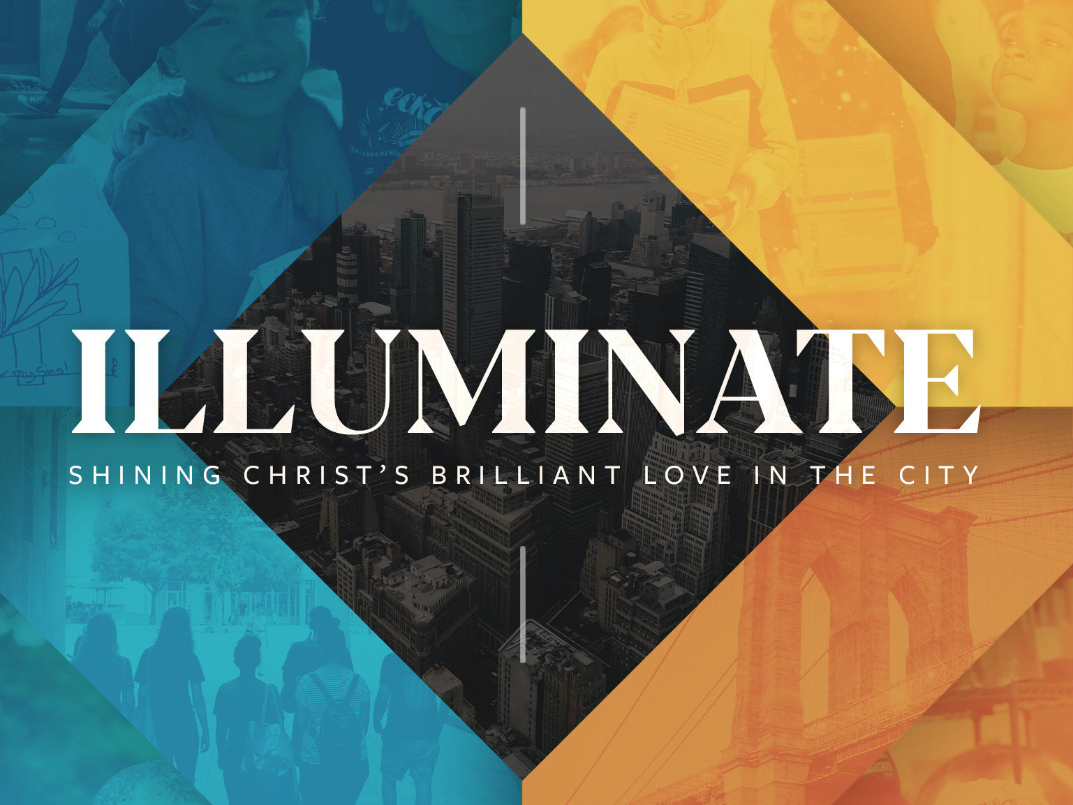
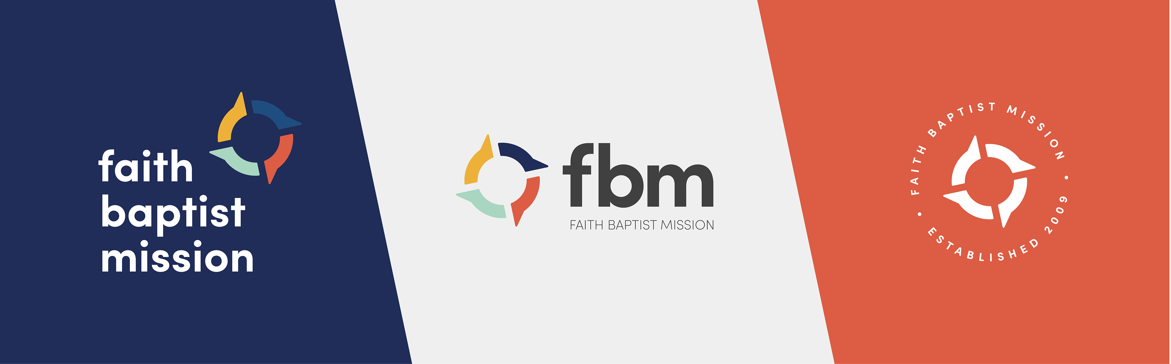
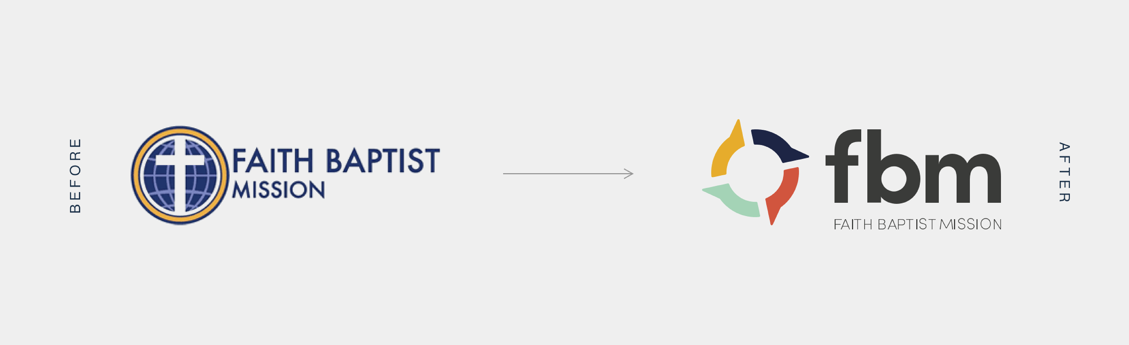
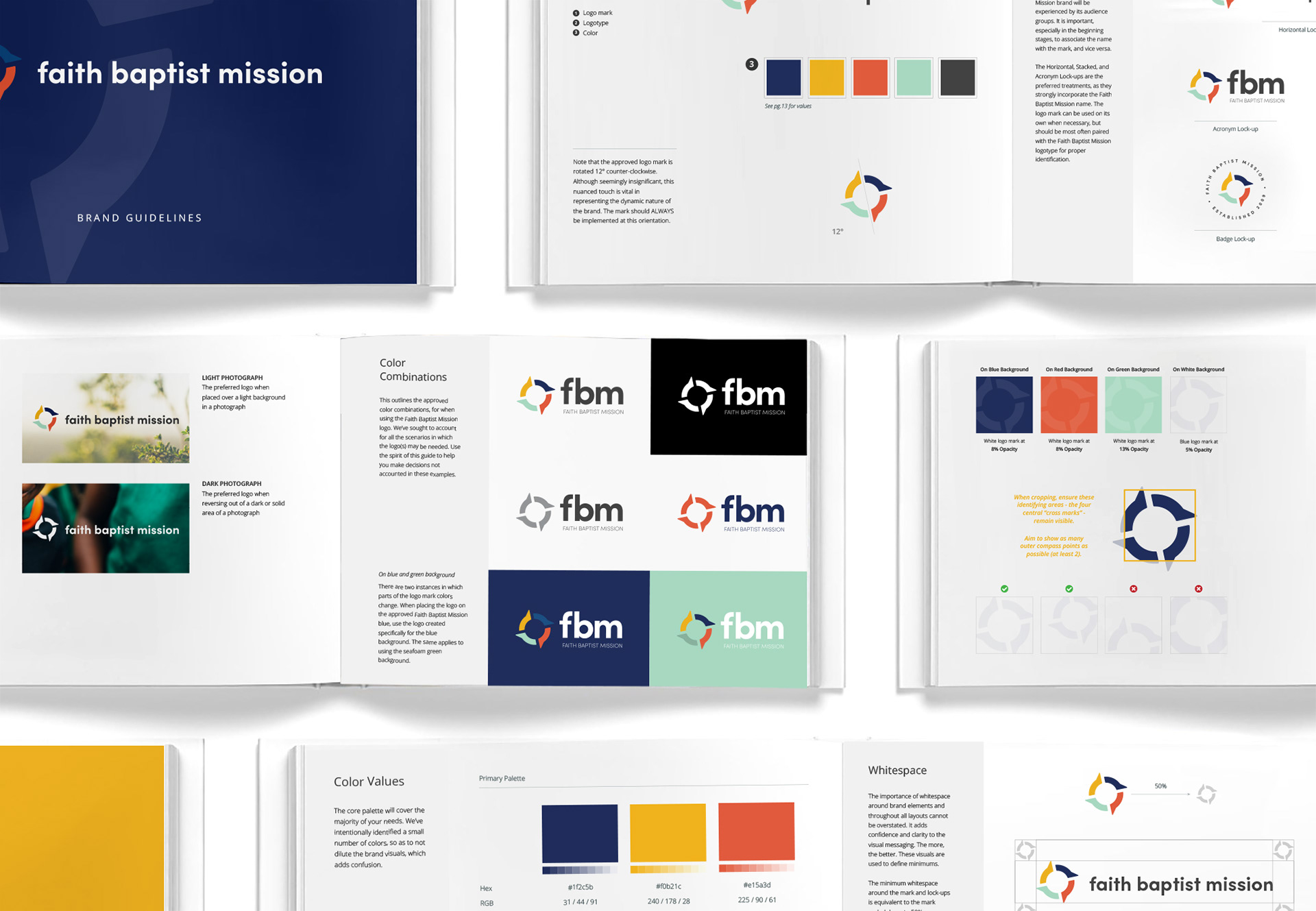
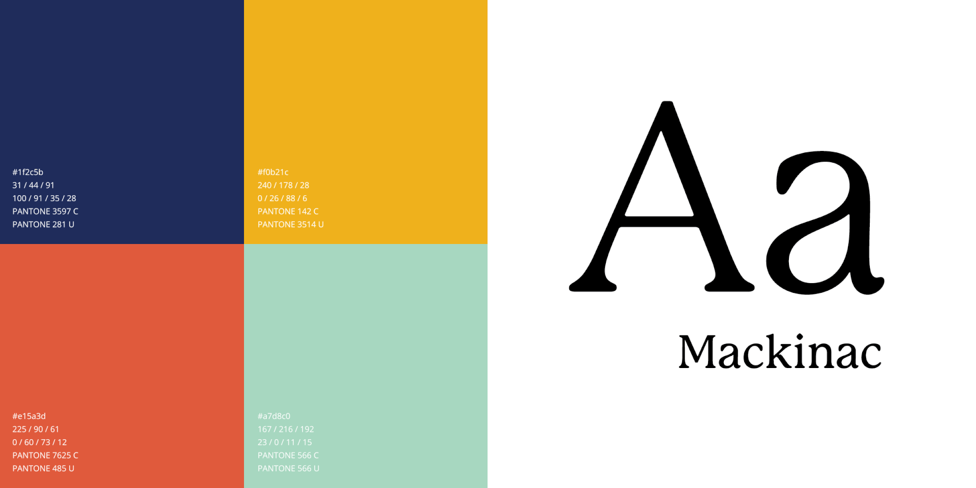
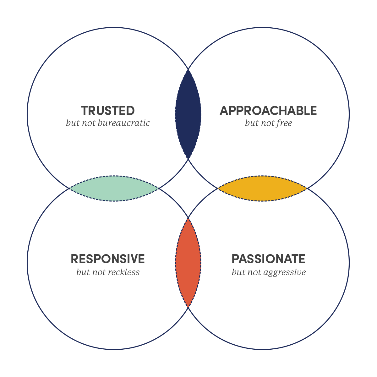
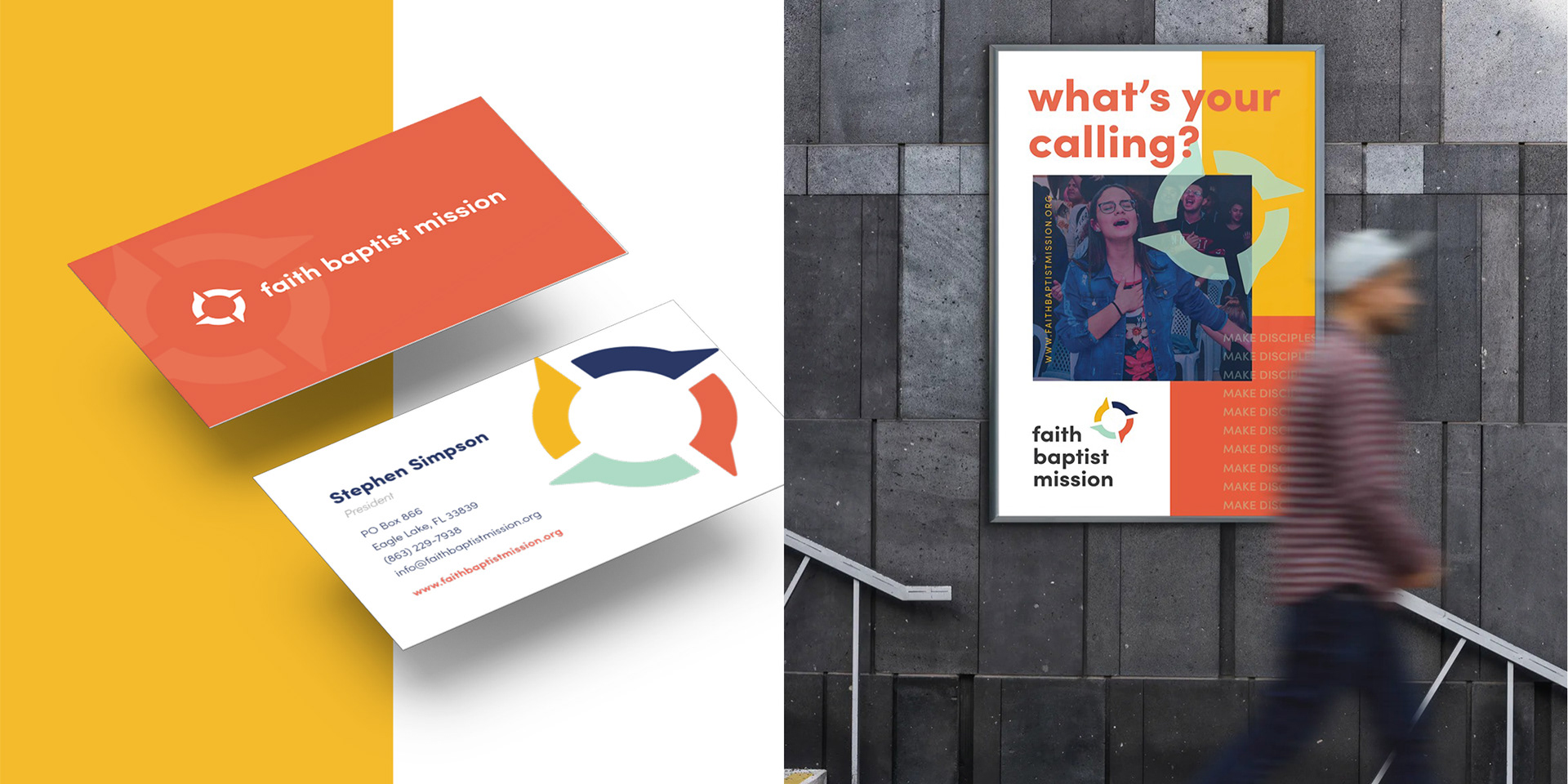
Turning to the visual identity, FBM needed a fresh mark that gave them some separation from their sister ministry—Faith Baptist Church. Additionally, the new identity system needed to appeal to a younger missionary audience. With the learnings from our strategy phase as a guide, we sought to develop a mark that supported the heart of the brand—missionary care. FBM functions as a guide, pointing new missionaries to where God is leading them, so the concept that most strongly resonated was the symbol of a compass. Using the brand essence attributes clarified in the strategy phase, we split this compass into 4 distinct, yet equal shapes to represent FBM’s Trusted, Approachable, Responsive and Passionate identity. Furthermore, the mark is tilted at 12 degrees to evoke a sense of movement, progress and energy, all attributes that FBM wanted to embody in this new season.

What makes FBM unique?
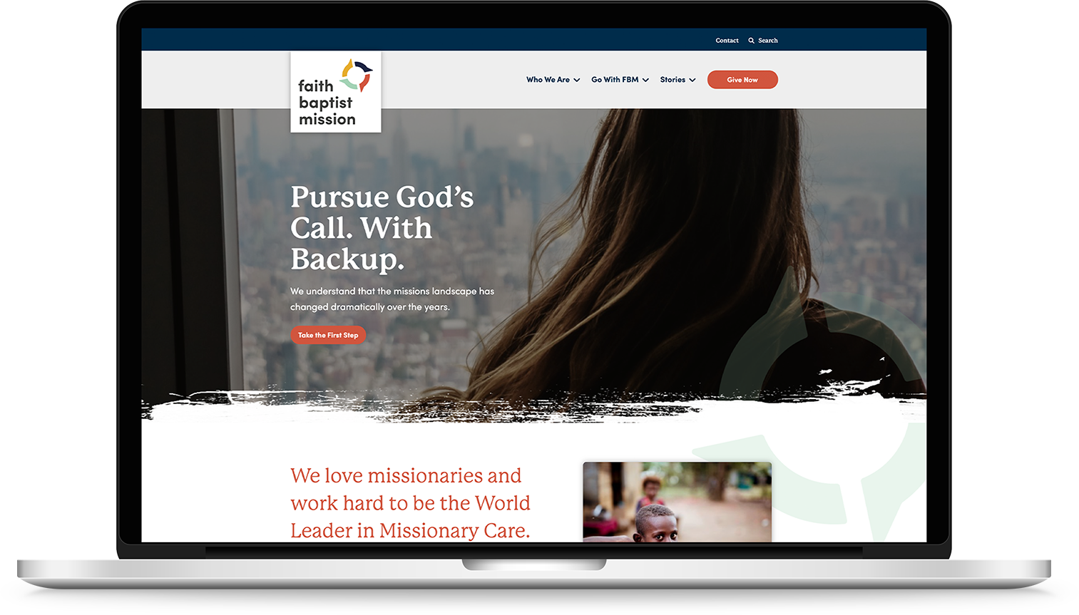
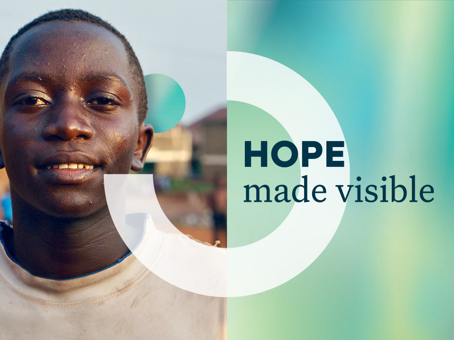
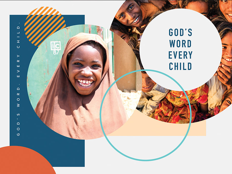
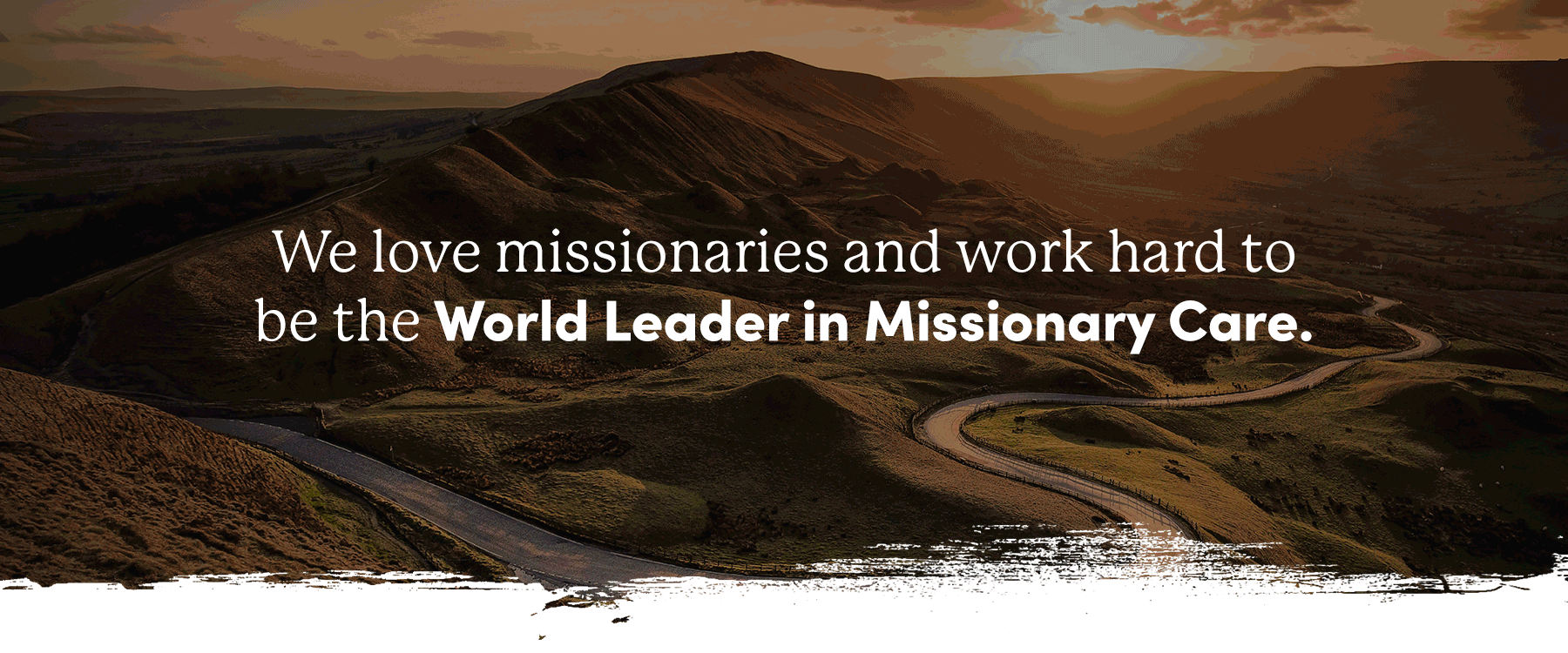
Faith Baptist Mission had to determine what made its brand unique. Why would a missionary want to work with FBM instead of turning to another sending agency? Through all of our strategic work and conversation, one common theme consistently emerged: FBM’s focus on missionary care. It was clear that the verbal identity needed to reflect this strength and take a bold, aspirational stance in saying: "We love missionaries and work hard to be the World Leader in Missionary Care." This straightforward and honest tone laid a foundation for how the brand would communicate moving forward.
Impacting FBM's online presence
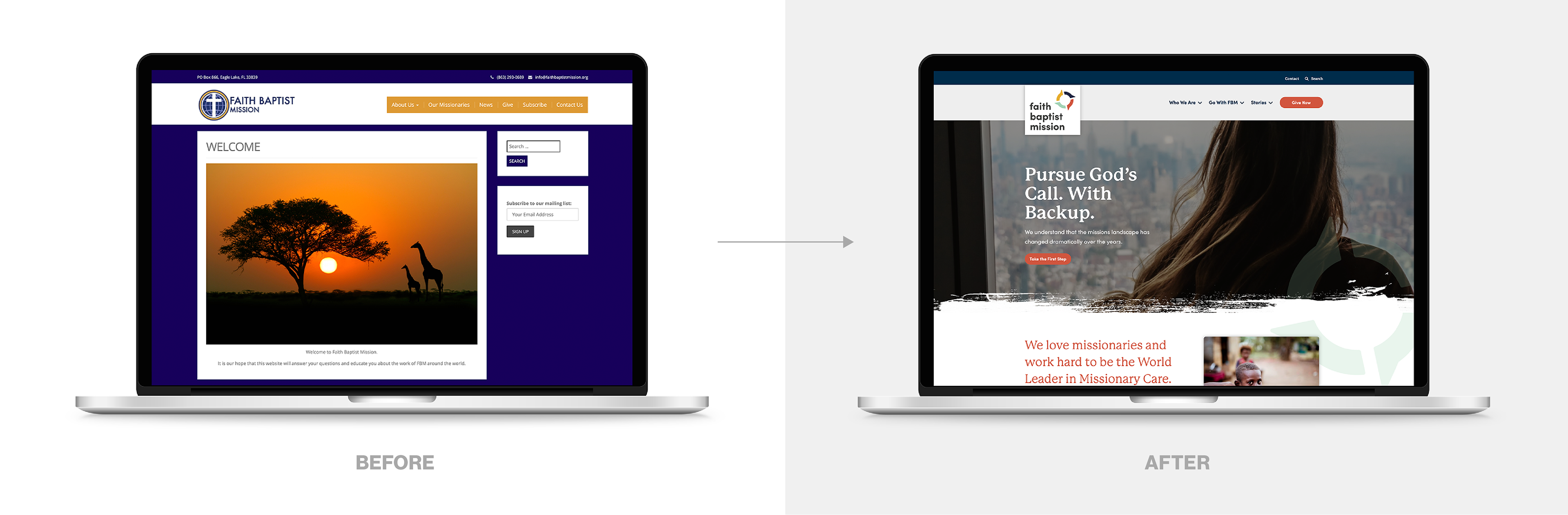
The impact for Faith Baptist Mission was clarity at every level. Furthermore, at the end of this process, not only did FBM have clarity on why they existed, but they were equipped with the tools necessary to communicate their value to the world with confidence. Where there once was an inability to articulate what made FBM unique is now a deep awareness of key differentiators. Where there once was an outdated and forgettable logo is now a vibrant, robust and forward-looking identity system. Where there once was a variety of approaches for communicating the FBM story to potential missionaries is now a clear, singular, compelling message.
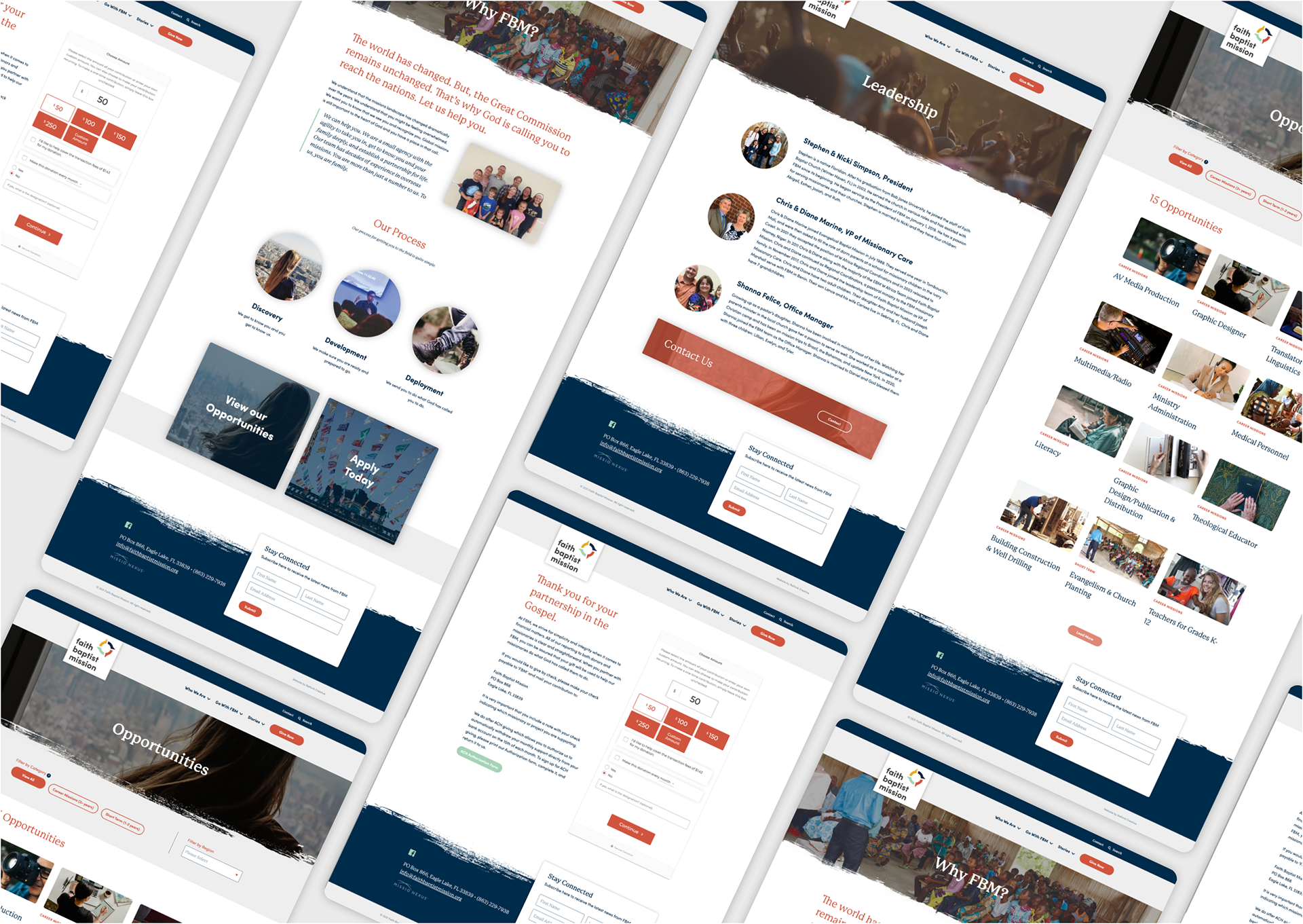
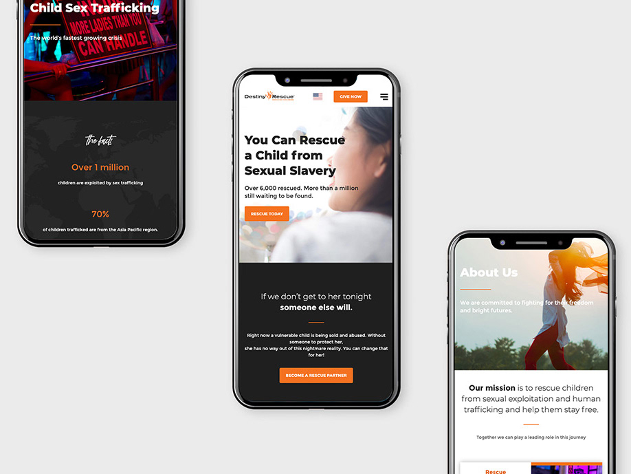
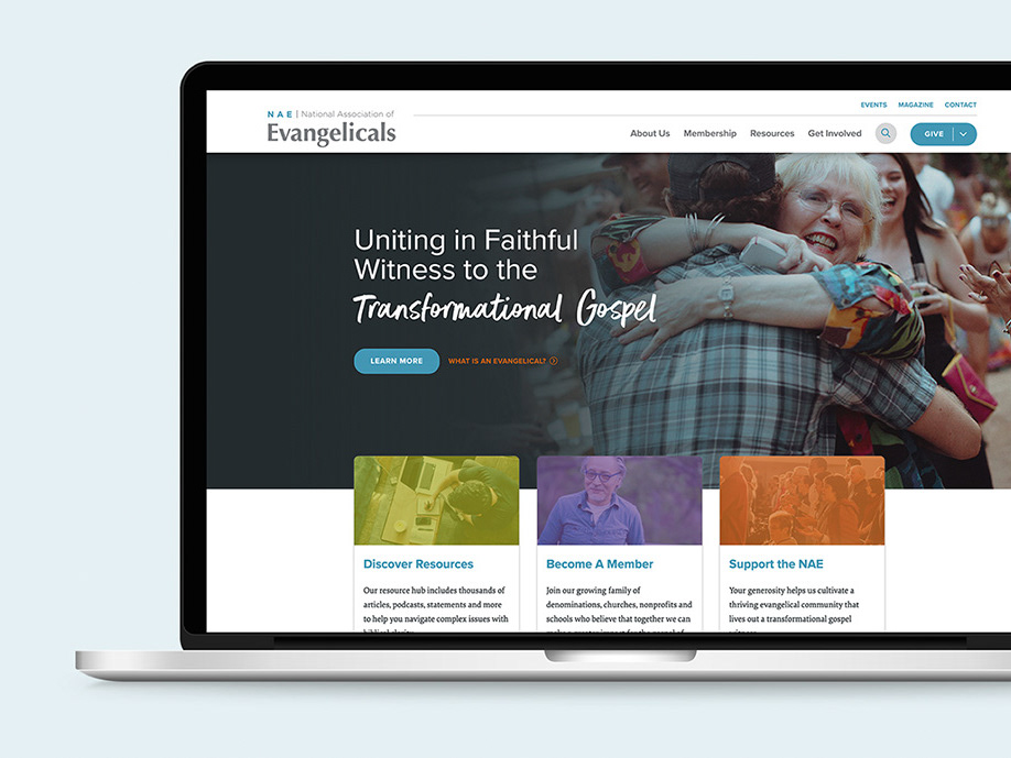
The greatest of impacts came in the form of a brand new website, which was in dire need of an update. Serving as the primary extension of the brand, this new website helped to streamline FBM’s mobilization process, strengthened FBM’s credibility as a trusted missions agency and removed barriers to donating to the ministry.