How a Willingness to Change Helped This Missions Organization Accelerate the Spread of the Gospel
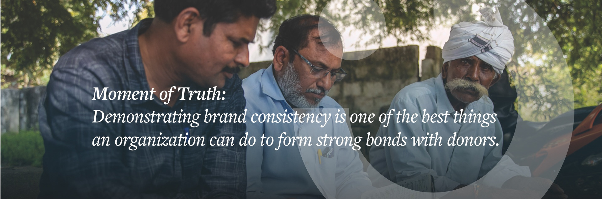
Open Eyes is a global missions organization dedicated to accelerating the Gospel of Jesus Christ to the unreached and underserved through evangelism, church planting, and relief and development efforts. On the heels of much organizational change and questions, Open Eyes needed to get clear on its organizational strategy, address some long-sidelined brand challenges, and develop a donor engagement strategy that would carry Open Eyes through a season of rapid growth.
Client
Open Eyes
Open Eyes
Scope of Work
Brand Strategy
Naming
Logo & Identity
Core Messaging
Website
Brand Strategy
Naming
Logo & Identity
Core Messaging
Website
Created at Rethink Creative

The need for brand clarity
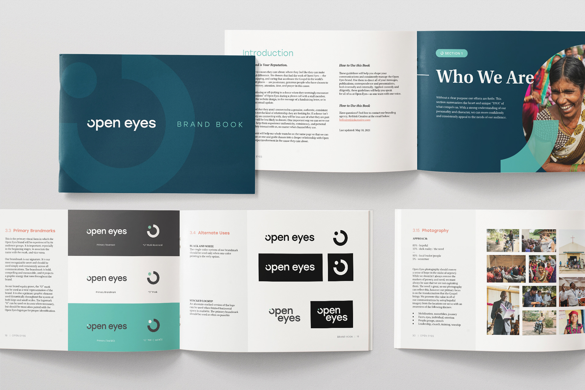
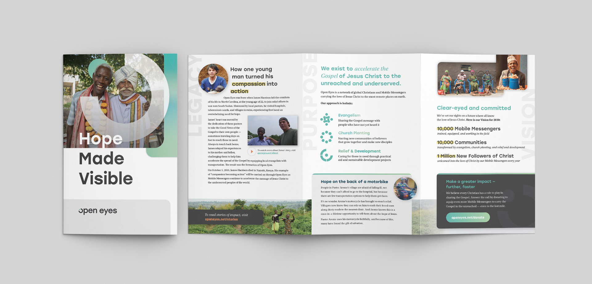
Formerly known as With Open Eyes, the organization's name created a number of challenges for its marketing team, not the least of which were an obvious “preposition problem” and the unfortunate “WOE woes.” A strategic rename to Open Eyes paved the way for the exciting opportunity to completely rethink the organization’s logo and visual identity, and help Open Eyes stand out from the crowd.
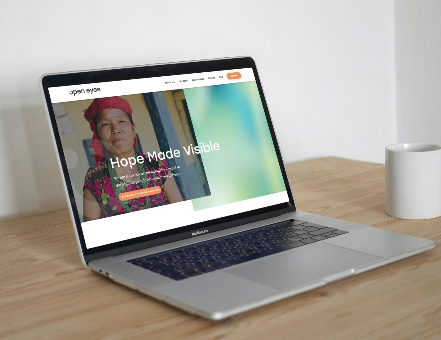
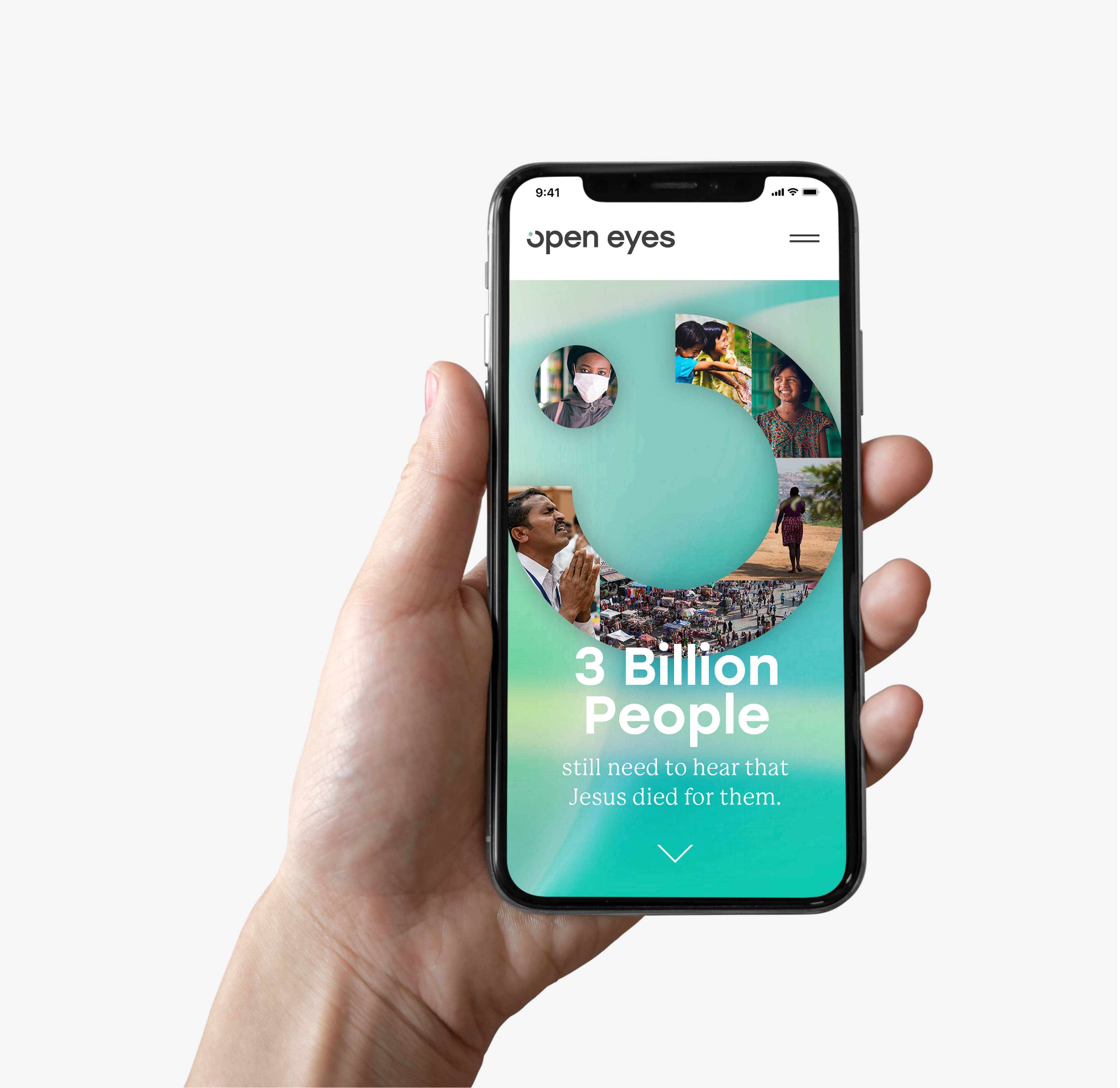
The new logo is as simple as it is powerful. The 'O' mark is reminiscent of an open eye — crisp in teal, gray, and white — that brings to mind a sense of hope, excitement, and possibility, revealing the optimism of the organization's vision to make hope visible throughout the world. The single dot represents the next "one" person who must be reached, seen and rescued.


Beyond the visuals
In addition to naming and visual identity, Open Eyes was also struggling to communicate its unique value and voice. To deliver on its ambitious expansion goals and garner enough support from donors, Open Eyes would need to develop a laser-focused donor engagement strategy backed by strong brand messaging that distinguished itself from other missions organizations.
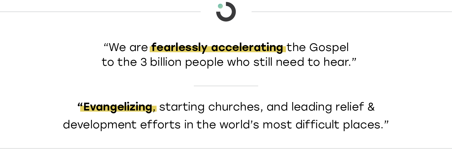
Emphasizing the donor’s need to feel like they are making a meaningful difference, Open Eyes’ messaging platform elevated the organization’s commitment to reaching those who have never before encountered the Gospel. A revised purpose statement and new core messaging put this in plain language:

Discovering the brand's personality
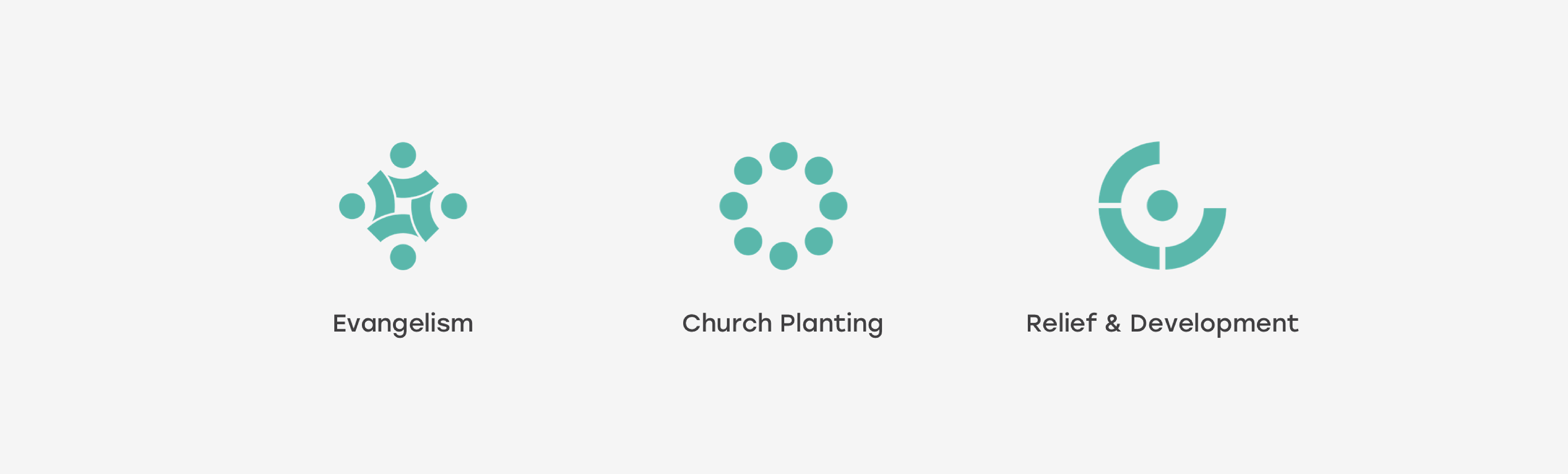
The messaging platform also helped distill Open Eyes’ missions for donors, boiling it down to three main concepts—Evangelism, Church Planting, and Relief and Development—with accompanying iconography that further reinforced the new brand identity.
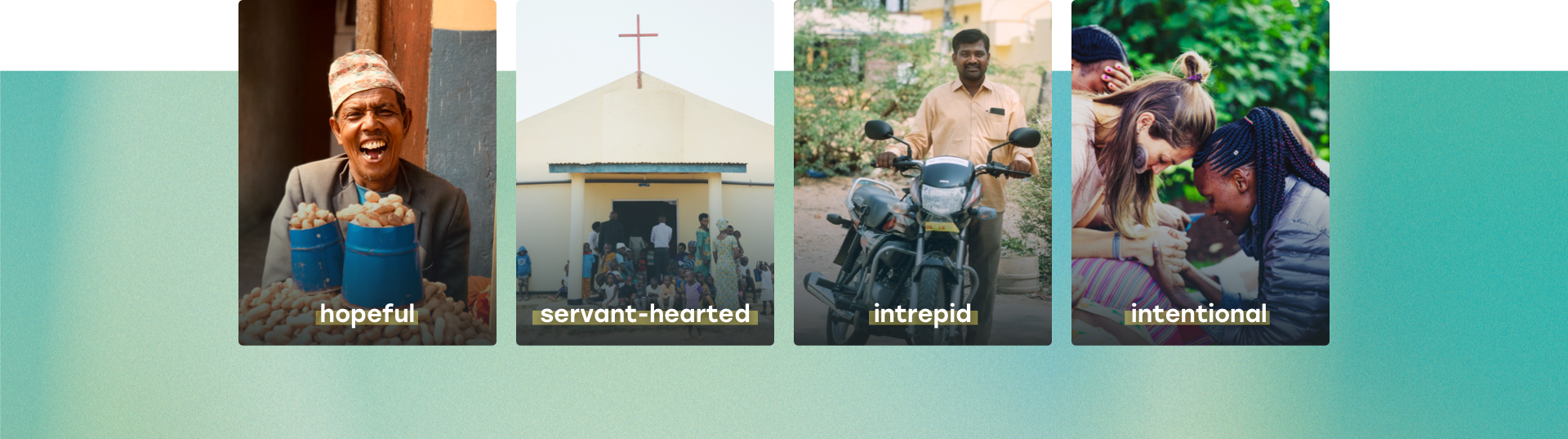
Further conversations with Open Eyes’ core team revealed a brand personality that was hopeful, servant-hearted, intrepid, and intentional. Open Eyes staff leads with their hearts, and that boundless optimism is what keeps donors supporting the organization year after year.
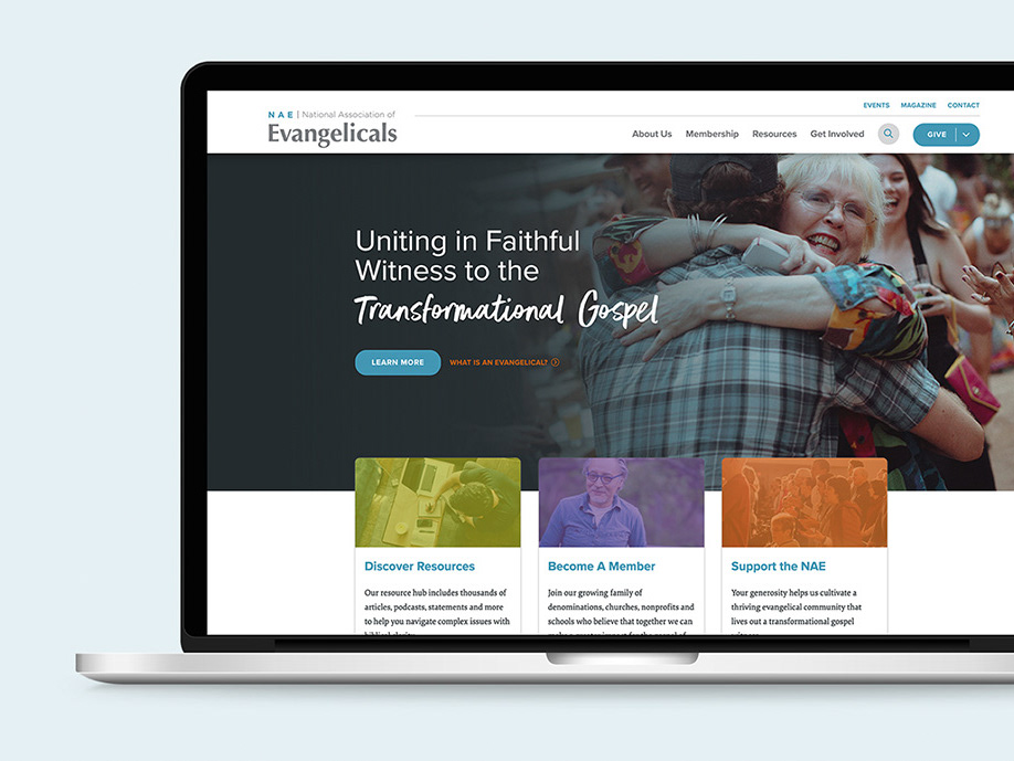
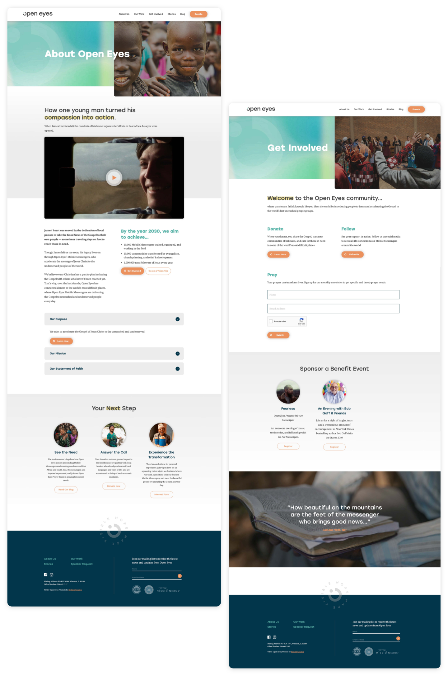
Telling a better story online
With essential brand architecture in place, it was time to tell Open Eyes’ story by reworking the organization’s web presence and taking the new brand public. The new website leverages creative ways to connect with donors, walks them through the organization’s mission and vision, and drives users to action. The hook, “Hope Made Visible,” helps tie the web story together, addressing how Open Eyes responds to the call, “How can they hear, unless someone is sent?”
The impact
The result of the Open Eyes rebrand, and the work that followed, was a grounded and more intentional missions organization. Not only did it help establish Open Eyes as a world-class organization, it created new points of connection with Open Eyes’ donor base and made it easier for passionate, generous people to become a part of the movement