How a Simple Brand Refresh Elevated a World-Class Organization to a New Level
In the competitive modern marketplace, no one—even a ministry—is immune to the complexities of trademark laws. When we first connected with OneHope, a global nonprofit that creates and distributes Bibles and other creative media expressions of scripture to children around the globe, the organization was muddling through the confusing process of obtaining a registered trademark for their nonprofit. And it wasn’t going very well. A popular California-based wine seller possessed original rights to the organization’s name. This complicated OneHope’s ability to establish ownership and protect itself against counterfeiters, cybersquatters, and importers of infringing product. The team needed to find a legal workaround.
Client
OneHope
OneHope
Scope of Work
Logo & Identity
Website
Collateral
Logo & Identity
Website
Collateral
Created at Rethink Creative
Turning a new page
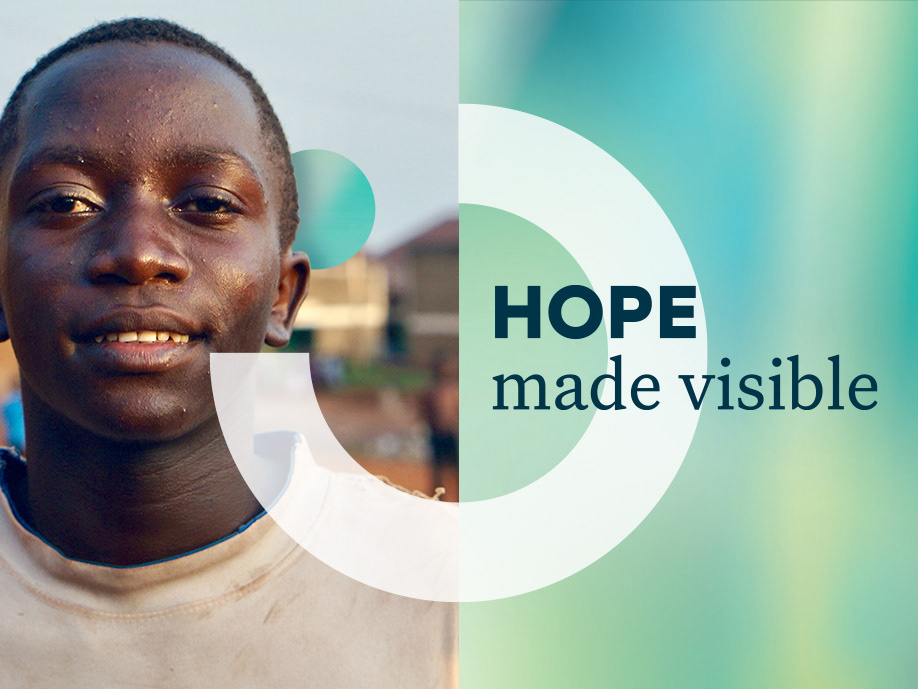
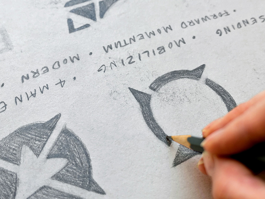
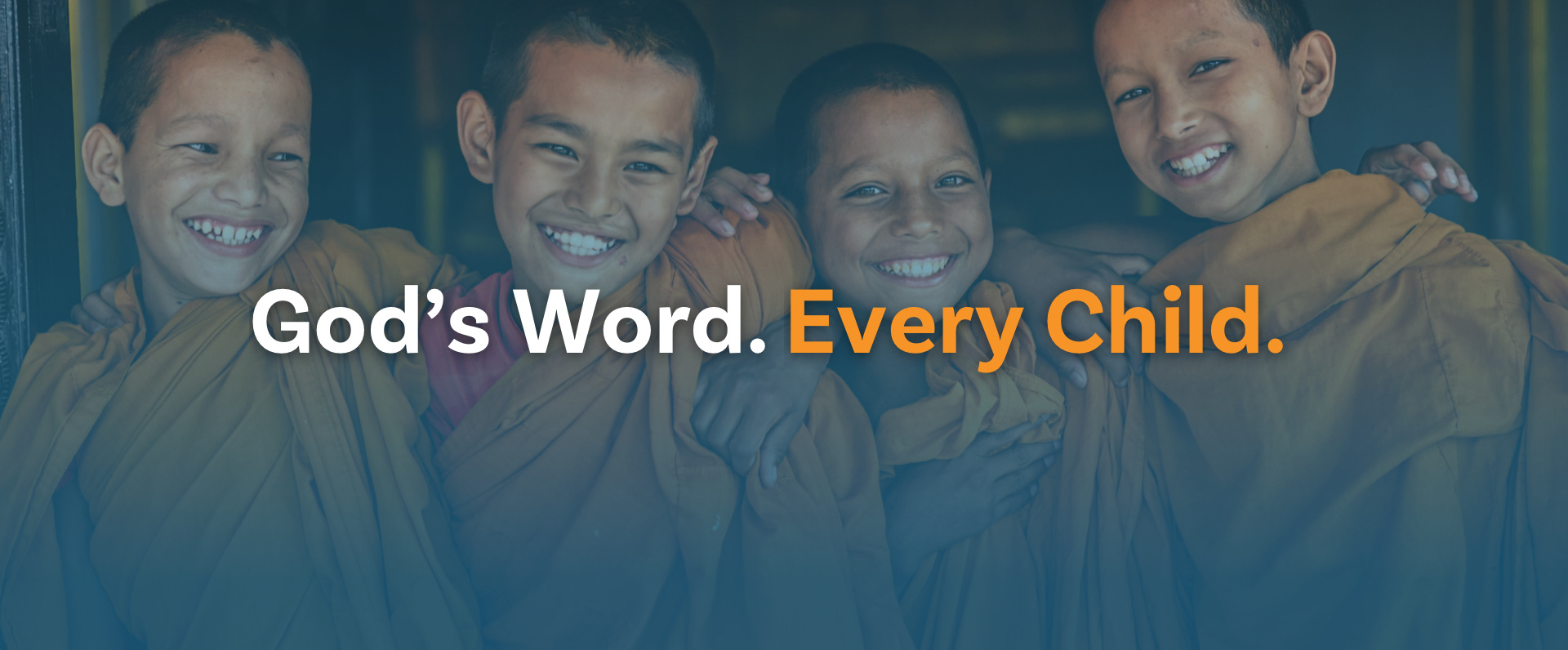
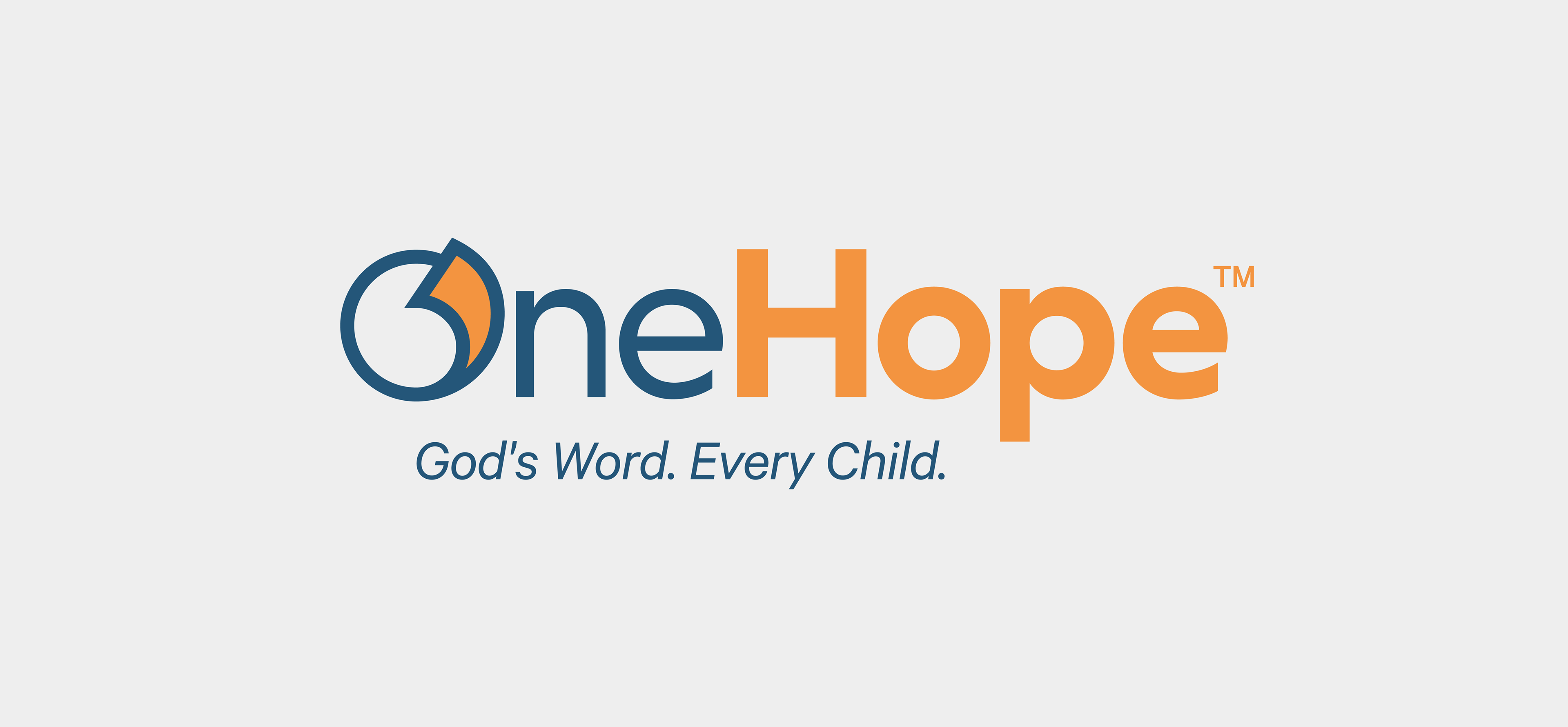
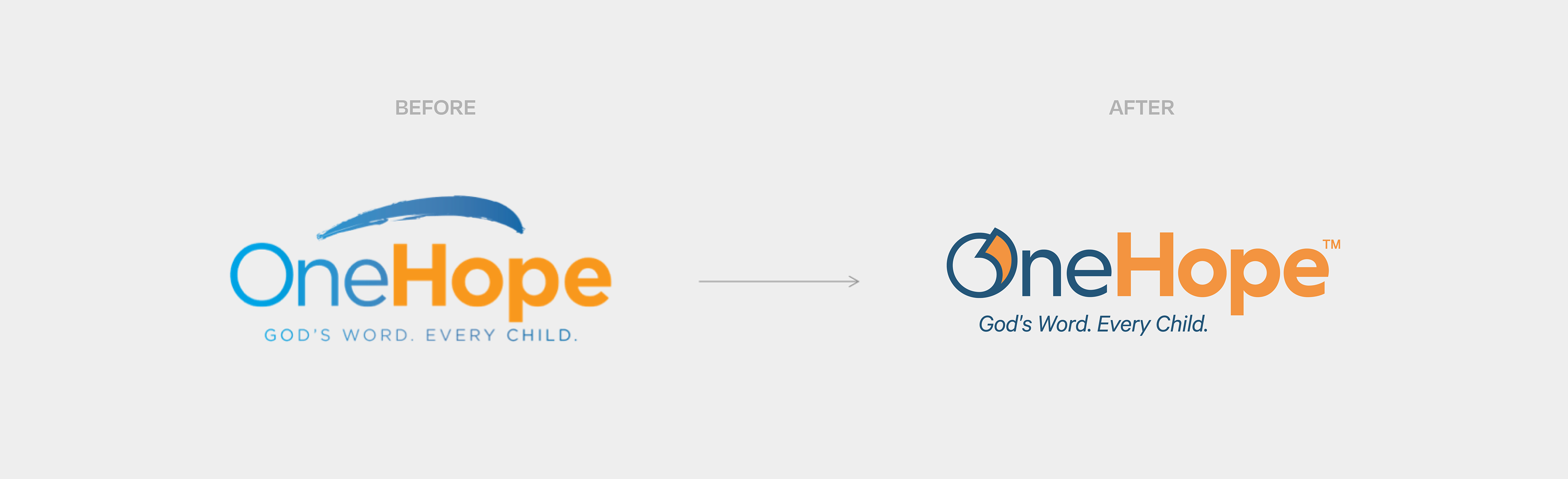
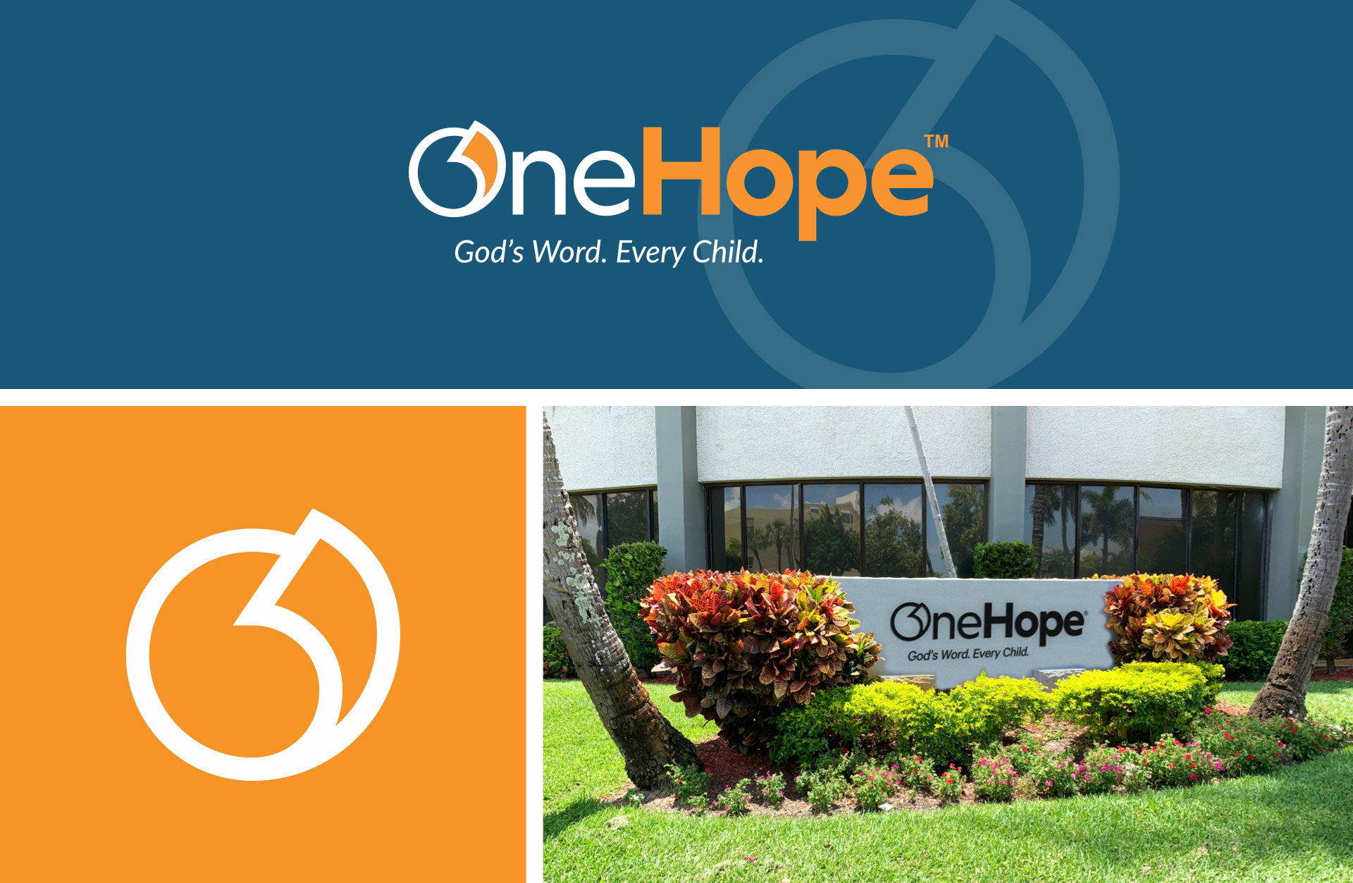
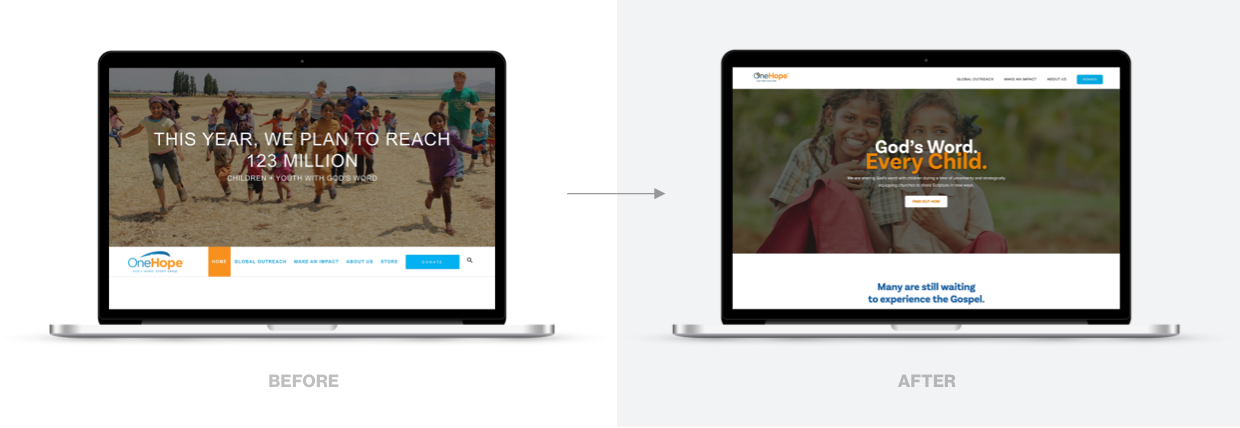
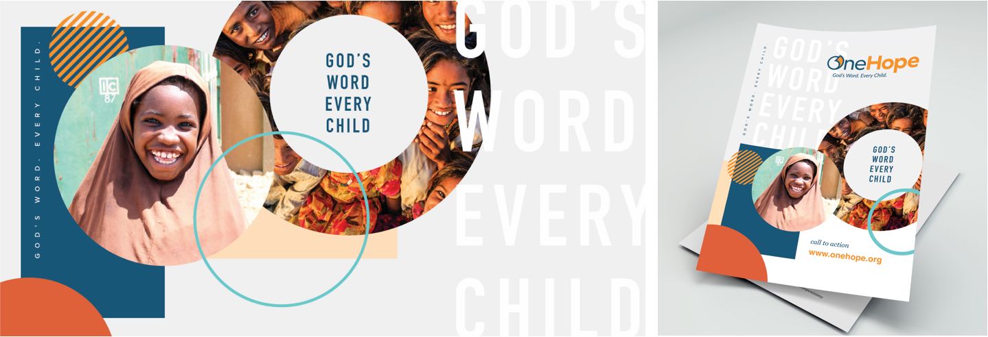
OneHope’s old logo felt dated and inflexible, and it was detached from the organization’s mission and brand essence. There was a lot of room for improvement. The new direction tactfully featured the tagline, “God’s Word. Every Child.” — a non-negotiable of OneHope’s registered trademark negotiations. This line, paired with a visual nod to a turning page, helped connect the logo to the organization’s mission and create beneficial feelings of innovation, integrity, and accessibility.
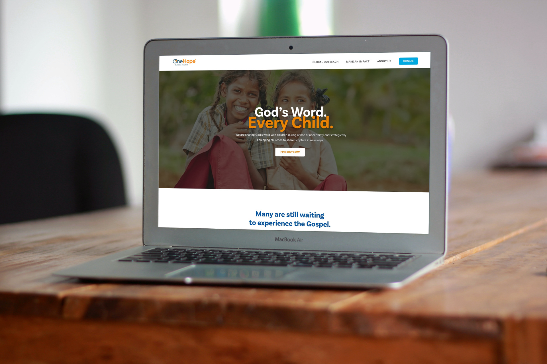
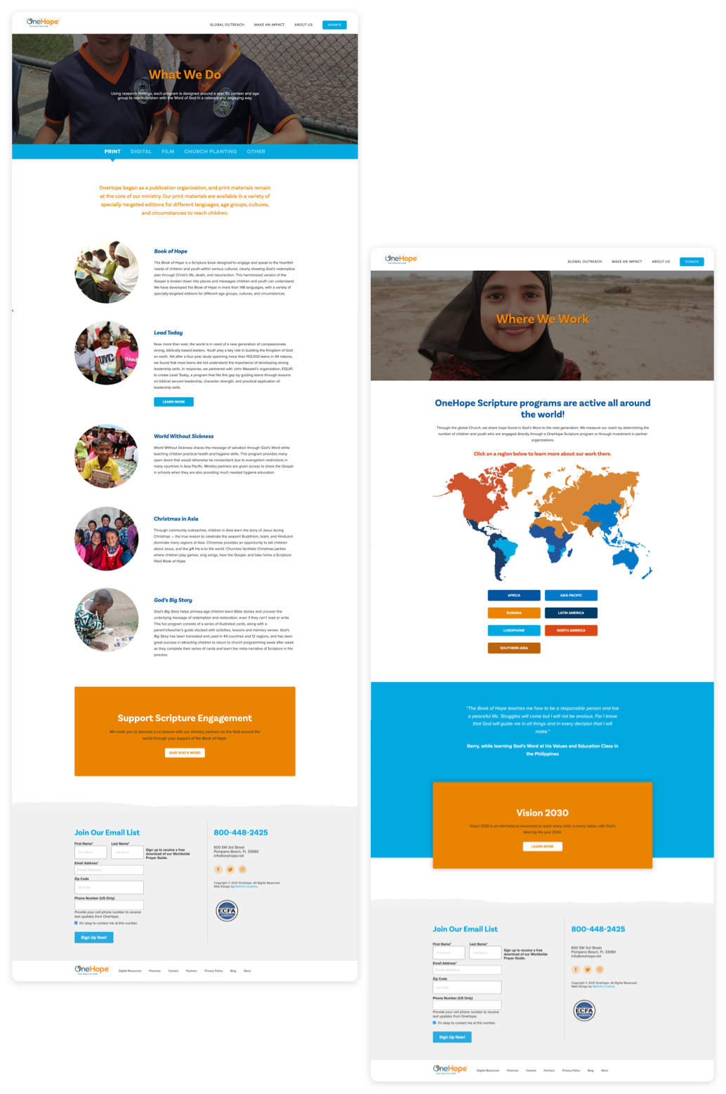
A more compelling user experience
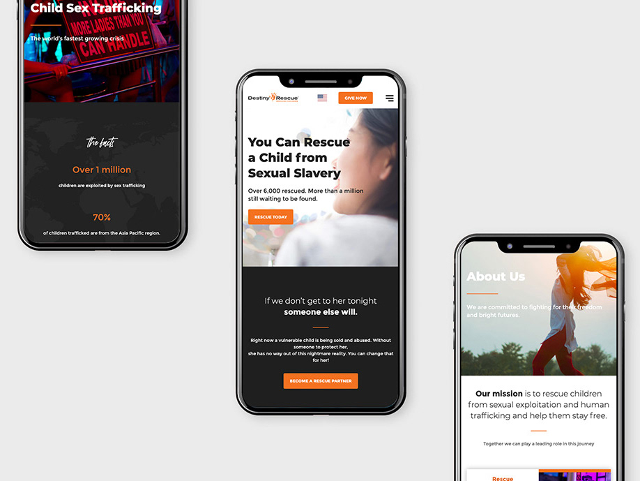
Once OneHope’s new visual identity was solidified, we turned our attention to the website. The objectives were pretty straightforward: recreate the site using the new visual framework and increase engagement by building a better user experience. More specifically, the team would need to remove hangups around donors getting involved, emphasize OneHope’s partnership model, and help build emotional momentum.
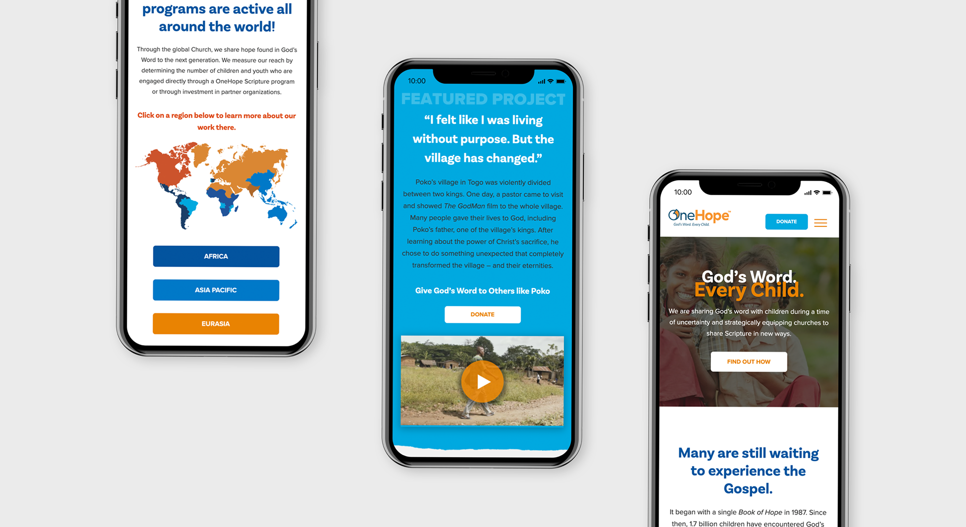
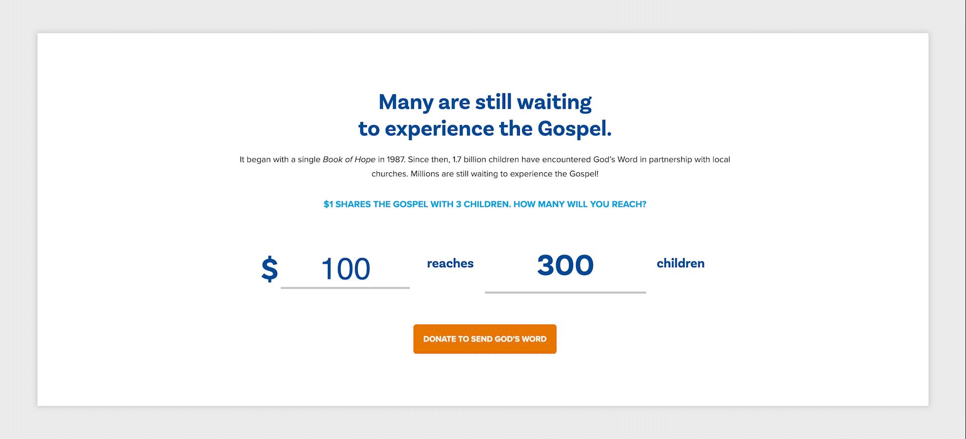
Donor engagement
Millions of children are still waiting to experience the Gospel. But to reach them, organization’s like OneHope need the financial support of likeminded donors. Making a plea for donations is always a delicate ask, but connecting the need to the request can help the conversation go more smoothly. In OneHope’s case, a simple slider which displayed how many children could be reached with a certain size of donation helped do just that.
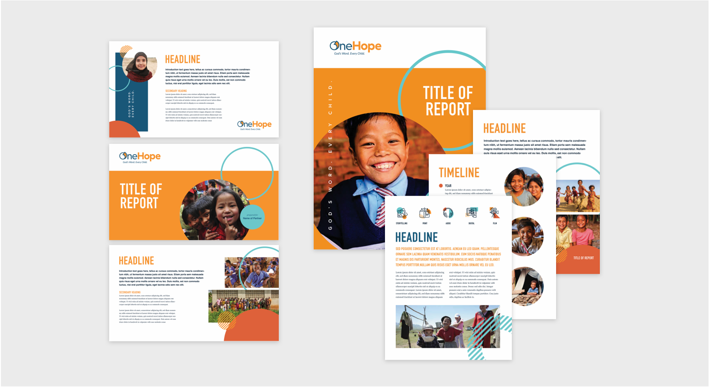
A toolkit for future growth
In addition to the logo refresh and the creation of the website, OneHope also requested support in developing a design toolkit, including numerous templates and a custom icon set. This toolkit reflected OneHope’s new visual identity and empowered the organization to make the most of the new brand.

The impact
Pursuing a brand refresh has opened many doors for OneHope. Now free to pursue its own registered trademark without question, thanks to the thoughtful revisions made to the logo, OneHope is working even faster to spread the Gospel to every child on Earth.
The website has also been a great success. Since the website launch, bounce rates have decreased and engagement has soared; print and digital materials reflect OneHope’s new visual identity; and more supporters become a part of the OneHope family every day. We are excited to see what’s still to come!
Bounce Rate decreased by:
95%
Pages visited per session:
Doubled
Donate Page visits increased by:
121%